St. George's

University.

St. George's

University.

St. George's

University.

Website redesign.

Website redesign.

Website redesign.

Category

Education.

Main Tasks

Lead UX/UI Design, Design system, IA asssit.

Category

Education.

Main Tasks

Lead UX/UI Design, Design system, IA asssit.

About the client:

Founded as an independent School of Medicine in 1976, St. George’s University opened its doors to students beginning in January 1977. It has evolved into a center of international education. Drawing students and faculty from 140 countries to the Caribbean island of Grenada, in the West Indies.

About the project:

After the successful deployment of a highly converting landing page, SGU decided to redesign its entire desktop and mobile experience. The goal was to organize and ease the process for accessing the vast amount of information on every academic program SGU offers.

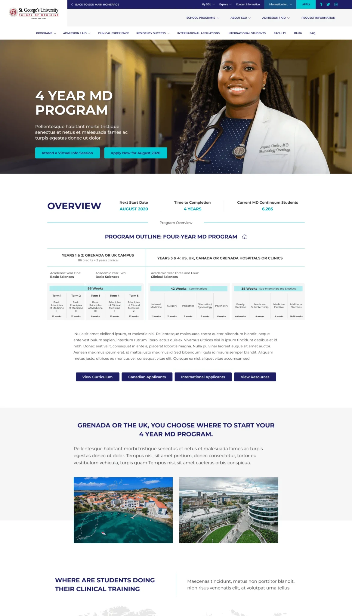
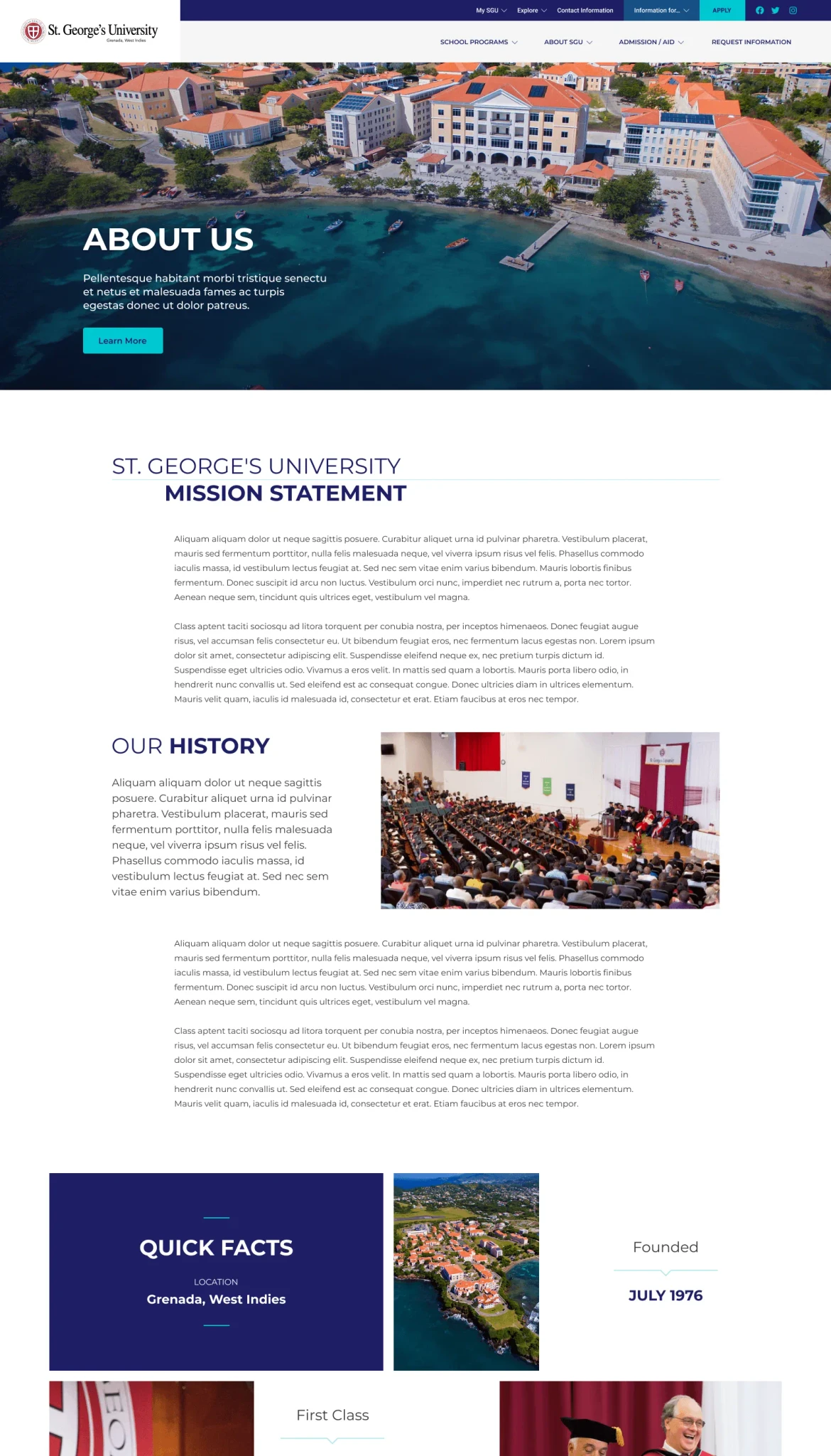
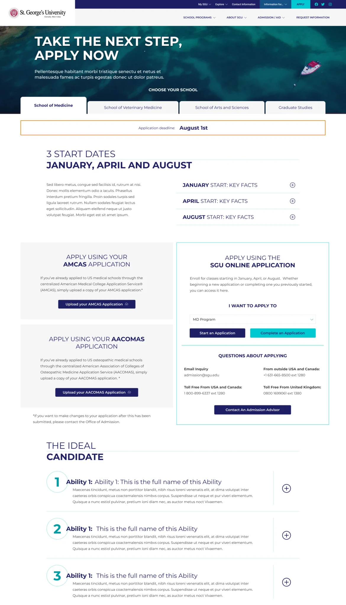
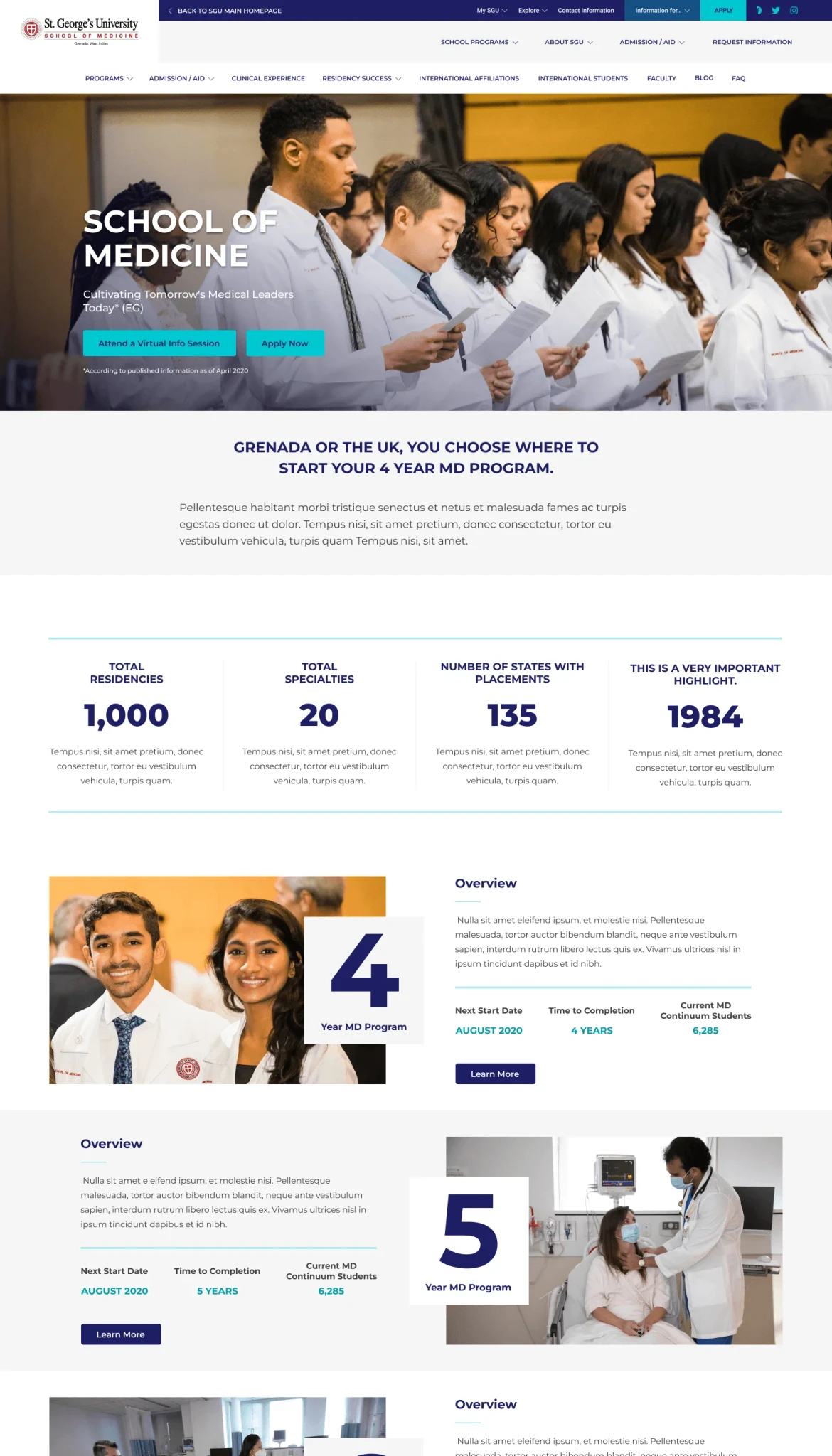
Desktop.

All the information in the original website was compiled and distilled into a set of master pages. These pages were designed with all the possible component combinations in mind. This approach provided flexibility within each master page and ease the creation of the sub websites for each school.

Mobile.

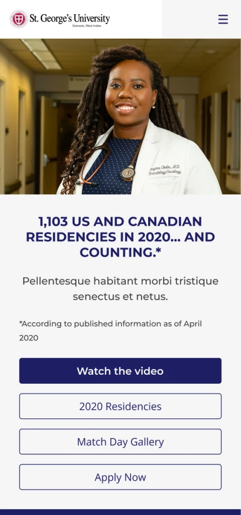
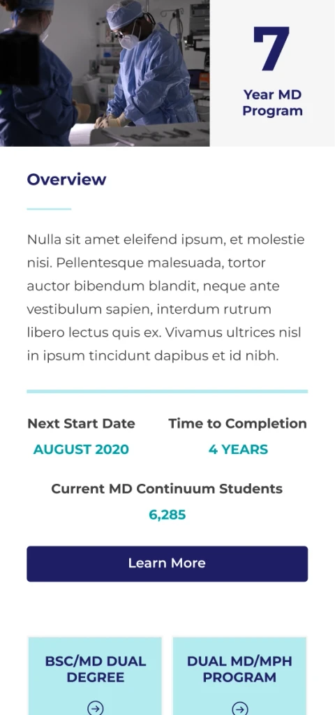
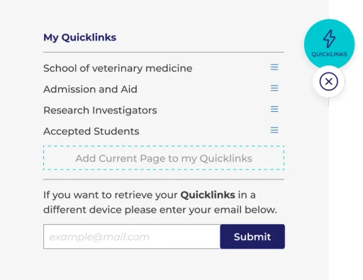
The components used throughout the project allowed a seamless transition to mobile displays, few minor adjustments were required to achieve the experience as in the desktop version.

Mobile.

The components used throughout the project allowed a seamless transition to mobile displays, few minor adjustments were required to achieve the experience as in the desktop version.

Mobile.

The components used throughout the project allowed a seamless transition to mobile displays, few minor adjustments were required to achieve the experience as in the desktop version.

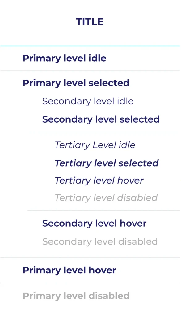
Styles and
components.

Styles and
components.

Styles and
components.

R: 30

G: 30

B: 100

#1E1E64

R: 63

G: 63

B: 63

#3F3F3F

R: 0

G: 155

B: 163

#009BA3


R: 0

G: 200

B: 210

#00C8D2

R: 178

G: 235

B: 238

#B2EBEE

R: 230

G: 230

B: 230

#E6E6E6

R: 245

G: 245

B: 245

#F5F5F5

@: mannuelregalado@gmail.com

© 2024 Manuel Regalado

Manny.

@: mannuelregalado@gmail.com

© 2024 Manuel Regalado

Manny.

@: mannuelregalado@gmail.com

© 2024 Manuel Regalado